Improve Your Digital Fitness Marketing Plan with Landing Pages


You've invested time and money into driving potential prospects to your website. It's possible you've become savvy with SEO, started a PPC campaign or maybe you expanded your social presence on Facebook. No matter what it is, you've increased the number of people visiting your website. It's an incredible start, but the marketing magic doesn't end there.
Once a potential prospect has made it to your site, your goal should be to convert them by collecting their information. And that's where the value of a landing page comes in. A landing page can be defined as the web page you use to convert strangers into prospects by collecting their information. All your online marketing campaigns should point to a landing page.
A landing page can be a page already on your website, or it could be a new page you create for a particular marketing campaign. As you become a more sophisticated marketer you will create more unique pages for targeted promotions or marketing campaigns. Regardless of whether you are just starting to develop your marketing program or are becoming more sophisticated, it is important that you set up the landing page correctly to effectively convert your prospects. Below you will find the key components of an effective landing page.
A). Lead capture form
The single most valuable component of a landing page is the lead capture form. A form is the only way you can make sure you are turning visitors into prospects by collecting their information. You can collect their information through a variety of call-to-action (CTA) options, but the components of the form remain the same. Keep it short and only collect what you need. I recommend: First Name, Last Name, Email and Phone. If you ask additional questions, such as fitness goals or how someone heard about your business, try not to exceed five fields (in the example we have more than five fields but only four are required*). Include a title on your form and make sure the submit button stands out. If all a visitor does is glance at the form, your visitor should be able to know what the form is for. A few examples of title and button combos are:
Are you offering a consultation? Then your form title could read, "Get a complimentary consultation" and the button text could say, "Request now." Or, if you're offering a free trial your form should have a clear title that reads, "7 day free trial" and button should read "Start Free Week."
B). Call-to-action
While the lead capture form is the most valuable component of your landing page, the call-to-action or CTA comes first. A CTA is a clear and concise offer that will prompt a visitor to fill out the lead capture form. Don't forget, your CTA must be valuable enough for someone to give you his or her information. Just asking someone to contact you in a traditional Contact Us form may not be enough. You will either need to explain why it's in their best interest to contact you or offer something like a consultation, free trial or downloadable piece of content (ex: meal plan). Those are items that make people feel like they are getting something for giving you their personal information. The CTA on your landing page should always align with the CTA in your marketing messaging that's driving visitors to the landing page. Running a Facebook ad about an event or new class you have coming up? Then create a landing page where signing up for the event or new class is the call-to-action.
C). Stats, facts & testimonials
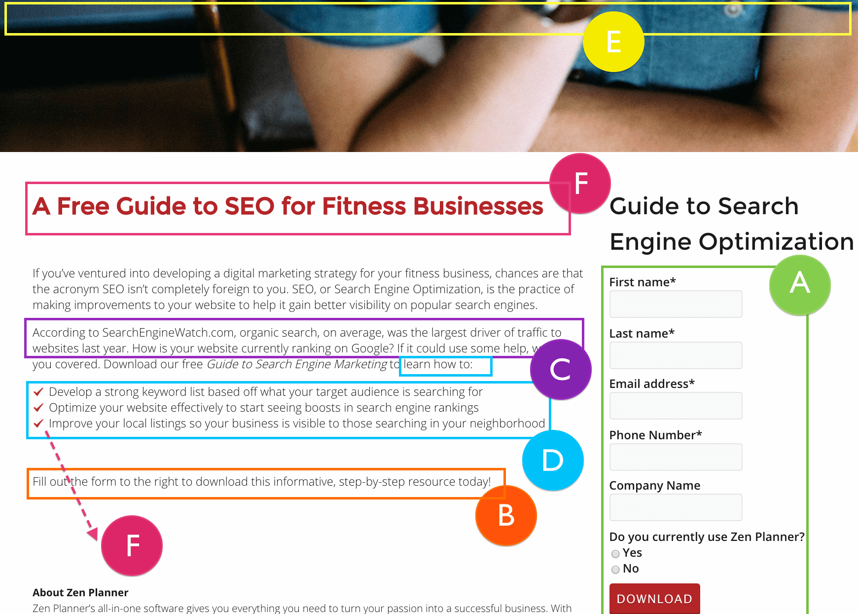 Numbers and proof speak louder than words. Every landing page should have stats, facts or testimonials to add value and drive a visitor to complete the CTA. Start gathering a few before-and-after pictures, testimonials and success stories from your top members and (with their permission) use them in your marketing materials. Those testimonials should be featured on your landing pages, website, emails, posters, social media pages and anywhere else possible.
You don't have testimonials or success stories? No problem. Research some industry statistics on why your particular type of fitness is essential to your target market. Maybe you target weightlifting for women. Find a statistic that emphasizes the value of weight training for women and how it can help with bone density. It's okay to add a little fear in this section of your lading page; it can be a highly motivating factor. [clearfix]
D). Value proposition
I've brought up value several times but it doesn't hurt to emphasize it again and explain what we mean. Your services or offering are valuable to your visitors but it's your job to clearly communicate that value on the landing page itself. Don't just assume a visitor will "get it" or be able to read between the lines. Take the time to clearly understand why your offering is valuable and explain that to your landing page visitor. If your programming is unique then explain how your thoughtful set-up will provide better results or more results in less time.
E). Remove the extra links
We've discussed items you should have but now lets look at an item you should exclude. A landing page is not the place to be linking off to other areas of your website. The goal is to keep the visitor focused on the task at hand, which is completing your call-to-action, by filling out that glorious form. If you have the ability, remove the navigation for your landing page to prevent any distractions. If you are clearly communicating your offer, it's value and what you want the visitor to do, there will not be any need for your visitor to visit other pages before filling out the form.
F). Simplicity
Simpler said than done, right? After everything we've outlined before it may seem unfair to pull the KISS (Keep It Simple Stupid) card but this must be your final thought when creating a powerful landing page. Do you have to scroll down a ways to get through all the copy? Then cut it in half. Is it all paragraphs? Add some bullets. Most visitors will only take enough time to scan your page. Use images, titles and bullets to get your point across quickly.
Keep in mind that you can start with one landing page and as your marketing strategy and offers grow, create more. Landing pages are intended to capture the traffic from your marketing campaigns and convert them into prospects as quickly and easily as possible. Once you've captured your prospect's information you will have a much easier time turning them into customers.
Looking for additional ways to beef up the marketing strategy for your fitness business? Get your copy of our informative 10-Step Marketing Guide.

I’m Coach Kelli, a devoted CrossFit gym owner with 15 years of experience managing my facility, along with owning yoga studios and wellness centers. Beyond the fitness world, I have a passion for cooking, cherish moments with my children and family, and find joy in spending time outside. Having experienced the highs and lows, I’m dedicated to leveraging my expertise to help you grow and succeed on your fitness journey.

I’m Coach Kelli, a devoted CrossFit gym owner with 15 years of experience managing my facility, along with owning yoga studios and wellness centers. Beyond the fitness world, I have a passion for cooking, cherish moments with my children and family, and find joy in spending time outside. Having experienced the highs and lows, I’m dedicated to leveraging my expertise to help you grow and succeed on your fitness journey.


