Improve Your Gym’s Website Accessibility
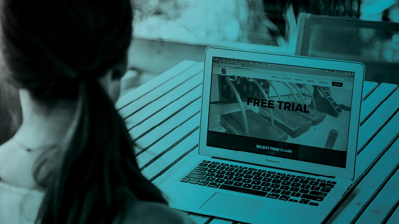

When looking at your gym's website, there is more to your site than what meets the eye. As the internet becomes more and more of a necessity, your website should hold up and be accessible to as many people as possible. What does that mean to have an accessible website? You want to think about how someone would experience your website if they are using the internet differently than you such as visual impairments, hearing related disabilities, cognitive impairments, and motor or dexterity disabilities.
Visual Accessibility
This can include colorblindness, low-vision, complete or partial blindness. Individuals may be using high magnification or screen readers. Some simple things to keep in mind:
- Colors and Contrast – Don't rely on color to get the information across. If you are using graphs or other visual representations of information look at adding patterns or shapes so if clients cannot see the color, the information is still there. Think about maintaining a strong contrast so your text or other content doesn't blend into the background and get lost. Keep meaningful text, icons graphics in a ratio of 3:1 with the background of your site.
- High Magnification – Keep your layout consistent. Make sure it follows an order so if clients cannot see the entire page at once, they can familiarize with the layout and navigate accordingly. One method to test this is called the straw test. Imagine you are looking at your site through the hole of a straw, can you navigate around the pages?Make sure there are clear instructions that can be followed without relying on the entire site being viewed at once. There should be a certain predictability, top to bottom and right to left of navigating the content.
- Text Equivalents – Any imagery should have a text equivalent and alt tags that can be read by the screen reader. A good rule of thumb is, if the meaning would be lost if you cannot see the image, it needs a text equivalent.
Get your checklist, 10 Things Your Gym Website Must Have
Audio Accessibility
This can include those hard-of-hearing or with total hearing loss. It is also a good practice in consideration for those visiting your website with their computer muted.
- Text Equivalents – Do you have videos or audio on your site? Consider how that information can be conveyed to your clients if they cannot hear. Just like visual content, podcasts, videos etc. also need a text alternative. Likewise, you generally want to give clients the option to mute videos if they are sensitive to sound or are in a place where they cannot play sound.
Cognitive Accessibility
This can encompass a wide variety of things such as learning disabilities, autism, epilepsy, injuries, etc.
- Some General Tips – Don't put time limits on important content. There are a lot of cool animations out there, but if it's important information make sure everyone can read it. Linear order matters. Keep a logical order left to right and make sure navigation works correctly.
- Speaking of Animations – Stay clear of fast blinking or flashing animations that could trigger a seizure if someone has epilepsy. Do you have animation or moving effects that could cause discomfort for people with vestibular disorders? This doesn't mean shouldn't use animation, but consider giving people the ability to turn on/off animations and don't rely on an animation to get the point across. The most successful animations have a defined start and stop.
Motor & Dexterity Accessibility:
This can be a consideration not only for those with motor disabilities, but also those using other devices like smartphones.
- Mouse-less Navigation – Not everyone is able to navigate a website with a traditional mouse. Can your website stand up to keyboard-only tracking and screen readers and still make sense? If you are sitting at your keyboard, try tabbing through your page. Are you able to get from top to bottom without getting stuck?Make sure you use the correct heading tags. Page titles are the first item read by a screen reader, and it will move from specific to general markup. Your content should be arranged in the correct order so it makes sense. Make sure your menu is set up with informative page titles so clients can navigate and know the difference between pages.
- Touch Interfaces and Responsive Design – Your website should be able to respond to different screen sizes and devices so if a client is using a tablet or cell phone the content is still there.
Improving your gym's website accessibility can be a bit of a process, but providing a seamless experience for all users will strengthen your brand and convert more visitors into prospects. Looking for more ways to improve your website? Download the guide below.

I’m Coach Kelli, a devoted CrossFit gym owner with 15 years of experience managing my facility, along with owning yoga studios and wellness centers. Beyond the fitness world, I have a passion for cooking, cherish moments with my children and family, and find joy in spending time outside. Having experienced the highs and lows, I’m dedicated to leveraging my expertise to help you grow and succeed on your fitness journey.

I’m Coach Kelli, a devoted CrossFit gym owner with 15 years of experience managing my facility, along with owning yoga studios and wellness centers. Beyond the fitness world, I have a passion for cooking, cherish moments with my children and family, and find joy in spending time outside. Having experienced the highs and lows, I’m dedicated to leveraging my expertise to help you grow and succeed on your fitness journey.

