Building Your Affiliate’s Brand


Branding is experiencing a renaissance. For those of us in marketing it’s been something we’ve always focused on, particularly for big brands. But now, in an age where seemingly everyone is conscious of their own “personal brand”, it has taken the concept to new heights. This is good news if you are building an Affiliate Gym brand.
When it comes to building a brand for your box, it is important you do so with intent. You want to consciously craft your brand to be true to yourself, your gym and what you want to eventually become. Every word printed, logo placed and sentence spoken should align and be consistent with your brand.
When most people think about brand, their first thoughts are often based around visual components. For many of the world’s most prevalent brands these markers of brand identity — brand colors, logo, imagery, typography — are seared into our minds and are inseparable from the brand itself.
This is because these brand elements are meticulously crafted and orchestrated to impart a lasting impression of the brand itself. A 30-second ad for Apple will feature its logo, its iconic minimalist imagery and other unique aesthetics that are definitively “Apple”. You’ll know a few seconds in it’s an “Apple ad”. Clearly, this is not an accident and the billions of dollars Apple has spent to build its brand is a testament to their branding strategy.
You’re not a billion-dollar company selling consumer products, but that doesn’t mean you can’t take away a few things from how they build their brand, particularly from a visual perspective.
Brand Colors:

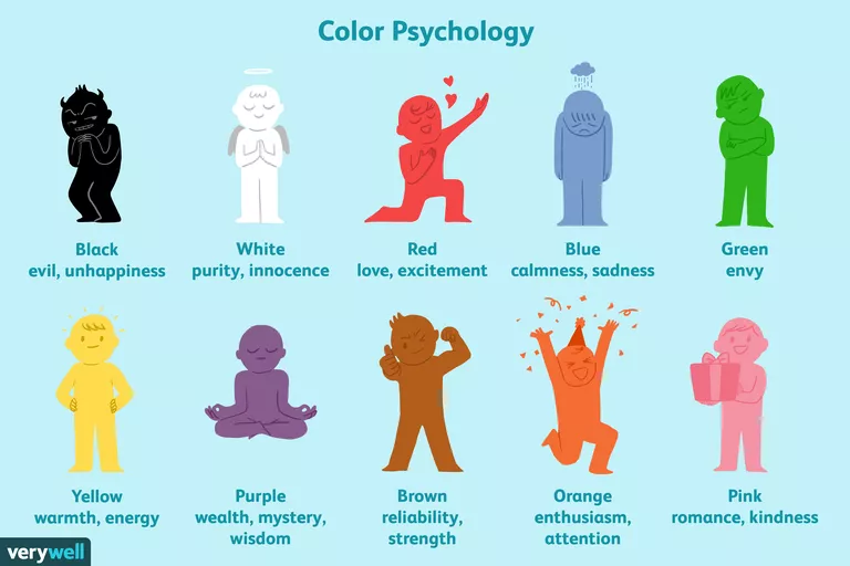
The psychology of color is fascinating. Books have been written on which color evoke which emotions, millions of dollars have been spent testing which color button people will click more and some brands have even legally trademarked specific hues (Tiffany Blue anybody?).
So, when it comes to selecting your own brand colors, just keep in mind everything you do going forward will hinge upon this decision. (just kidding, but it is still an important consideration.)
When selecting brand colors, think about the values you want to convey and look at one of the many color of psychology infographics available online. (Blue = Trust, Orange = Fun, etc.)
A best practice would be to select two main colors for your brand and then a third complimentary “accent” color you can use when you need a little extra splash of color.
There are plenty of tools online which can help you do this, like coolors.co, which makes it super fun and easy to get a color palette for your brand.
Looking for Ways to Market and Brand your Box? Check Out Our 10-Step Marketing Guide for Affiliate Gyms!
Logo:
Thankfully, clip-art logos have become a thing of the past, in large part because there are so many options out there for getting a good logo design. Now you might be thinking, “I don’t need to pay someone to design our logo” (you’re probably wrong) or “a logo isn’t that important” (you’re definitely wrong).
Your logo might be the most important part of your brand identity. It’ll be in your gym, across your social profiles, business cards, your website, it is the visual embodiment of your brand. It makes sense to get it right. Even if it means shelling out $100-$1000 to do so.
From a logo design perspective there are dozens of different styles to choose from minimalist designs, to fun character logos, to wordmarks which are just the brand name written in a custom font. With so many options to choose from, your best bet will be to find a designer to work with to make the perfect logo for your brand. An old-school tip which is coming back in fashion is to make sure your logo looks good both in monochrome and at a small size, which is helpful for branding on social media, smartphones and t-shirts in particular.
Typography:
Often overlooked, your typography is also an extension of your brand. Some brands (Netflix, Apple, Samsung) have even commissioned their own font typefaces to use exclusively for their brand. Your business doesn’t need to do this, but it underscores the importance typography plays in branding.
For your brand you should select one or two fonts or typefaces to use. The ones you choose are up to you, pair heavier fonts with lighter fonts, serifs with non-serifs, etc. The main thing you want to strive for is consistency with how you use your fonts, particularly on your website, but also with marketing materials and signage within your facility. You should use the same font for your headers, your alternate font for body or paragraph text, and make sure your consistent across your brand portfolio.
Just like with brand colors, there are a variety of font pairing tools online like fontjoy.com if you plan to DIY your branding.
Photography:

In a world littered with terrible stock photos, you have a real opportunity to differentiate your brand by using unique, high quality images of your students and studio. Most business owners have access to a camera that is able to take the high-quality photos you need (honestly, any modern smartphone will do the trick). Your photos should have consistency in quality, lighting, subjects etc. when possible.
Producing high-quality images is more than just having the right equipment. You need to have the right lighting, good framing, the right angle, etc. There are plenty of tutorials available online to help you learn how to take good pictures. You could also reach out to your students to see if you have any amateur photographers looking to make a few extra dollars while doing a photo-shoot for your studio.
Website:
Your website is the place where all of your brand elements converge. Here more than anywhere else you need to make sure everything is up to spec relative to your brand.
One way to make this easier is to build out brand guidelines. At Zen Planner we’ve got a 40-page brand guidebook that dictates colors, logo usage, fonts, photography and copy. Your own brand guidelines don’t need to be nearly as robust, but it should be documented, if only in a one-sheet format for you and others can reference.
With your brand guidelines in hand, building out your website should be much easier. Even if you outsource your website design (say, with Zen Planner and our high-quality, lead-driving websites) you can provide your brand guidelines, images and logo and we’ll build your site out exactly to spec.
Other Brand Considerations
Visual components are what most people think of when it comes to branding, but there are other considerations which are just as important to building out an amazing brand.
Brand Voice:
Your brand voice has a huge impact on how you and your brand is perceived. Are you straightforward, no-nonsense and results oriented or more laid back, experiential and community focused? Both examples can be effective when catered towards a specific clientele, but can be detrimental for a different market.
This is why it’s important to be intentional with your brand’s voice. Identify your target market, your existing personality and voice as an owner and what you want your business to be for your members. Once you’ve got those components dialed in, you can build out your brand voice. You can incorporate your voice into your brand guidelines just as you did with your brand colors and typography (check out MailChimp’s style guide for a great example) so when you are working with your coaches or outside help they have a reference to make sure everything stays “on brand”.
Brand Actions:
Incongruency is a major warning sign for humans. It’s like a 6th sense, if we notice something is out of place or unusual we set off internal alarm bells and we become more defensive. Even if it isn’t something remotely dangerous, we are still left with a feeling of dissonance. Like when a picture is tilted ever so slightly, or a color is just a shade off, we notice and unnerves us if only a little bit.
This is why it is important your actions align with your other brand elements. How you act in-class should be consistent with how you act on social media, at community events, or in other day-to-day interactions. This is important for your employees to know, but even more important for you as the owner. You should be the walking embodiment of your brand and make sure your actions align with how you want your brand to be presented.
Good branding is not accidental, it’s intentional. Whether you’ve got a new business or if you’ve been in business for years you can always do something to improve your branding. Starting with the areas outlined above is a good place to begin, but it’s important to remember branding is a constant, ongoing part of your business that you need to tend to in order to be successful.
Looking for additional affiliate gym marketing tips? Get your copy of our 10-Step Affiliate Gym Marketing Guide. We provide easy to follow tips on how to develop a well-rounded marketing strategy for your box.

I’m Coach Kelli, a devoted CrossFit gym owner with 15 years of experience managing my facility, along with owning yoga studios and wellness centers. Beyond the fitness world, I have a passion for cooking, cherish moments with my children and family, and find joy in spending time outside. Having experienced the highs and lows, I’m dedicated to leveraging my expertise to help you grow and succeed on your fitness journey.

I’m Coach Kelli, a devoted CrossFit gym owner with 15 years of experience managing my facility, along with owning yoga studios and wellness centers. Beyond the fitness world, I have a passion for cooking, cherish moments with my children and family, and find joy in spending time outside. Having experienced the highs and lows, I’m dedicated to leveraging my expertise to help you grow and succeed on your fitness journey.


